.jpg)
Visual Brand Development
for Private Equity
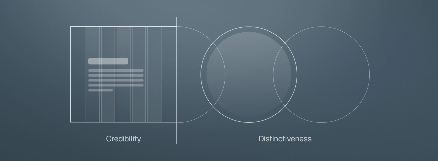
Visual branding in private equity used to be an afterthought. For years, firms relied on generic templates — navy-blue palettes, skyline photography, indistinguishable websites. Those choices signaled credibility at the time, but today they only signal sameness.
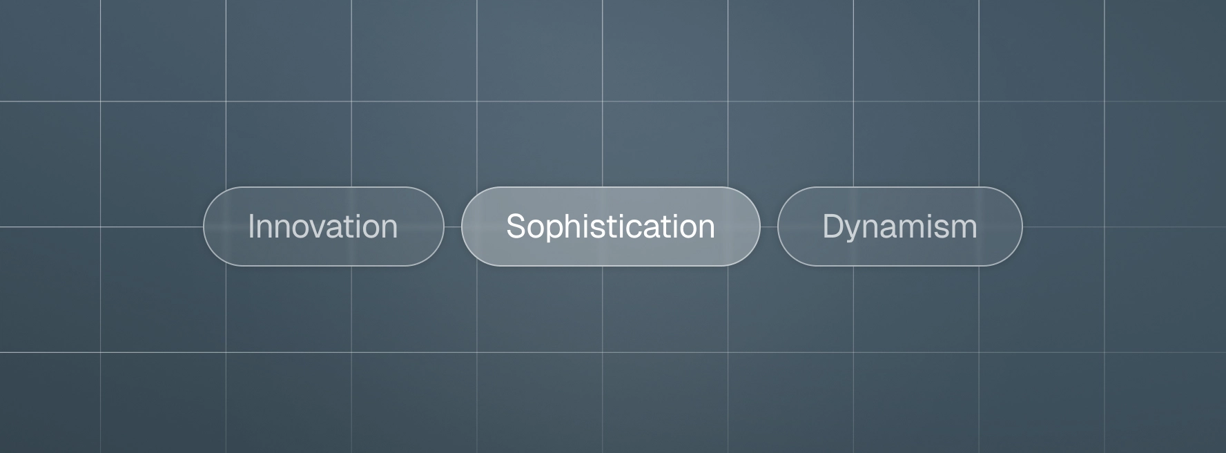
A strong visual brand is not just a collection of colors, fonts, and logos. It is a form of storytelling. Through motif, metaphor, and design choices, a visual brand can evoke a feeling — stability, dynamism, sophistication — that words alone cannot convey. At Darien Group, we develop visual brands that are rooted in authentic messaging and brought to life through design that communicates meaning without a single word.
Why Visual Brand Matters in Private Equity
Our Approach
- Logo design or refinement
- Typography system
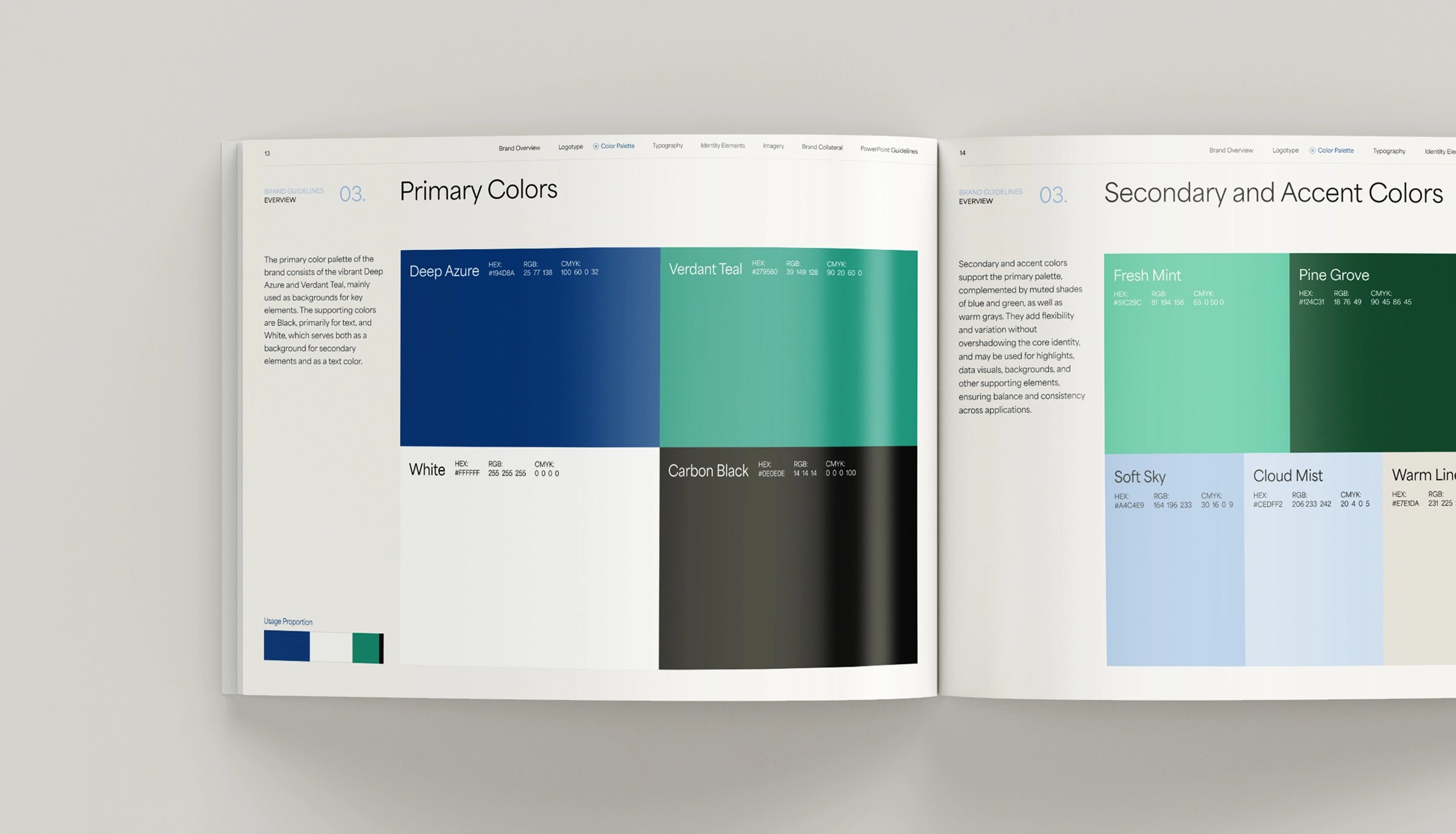
- Color palette
- Imagery style and guidelines
- Layout and composition standards
Longevity and Application
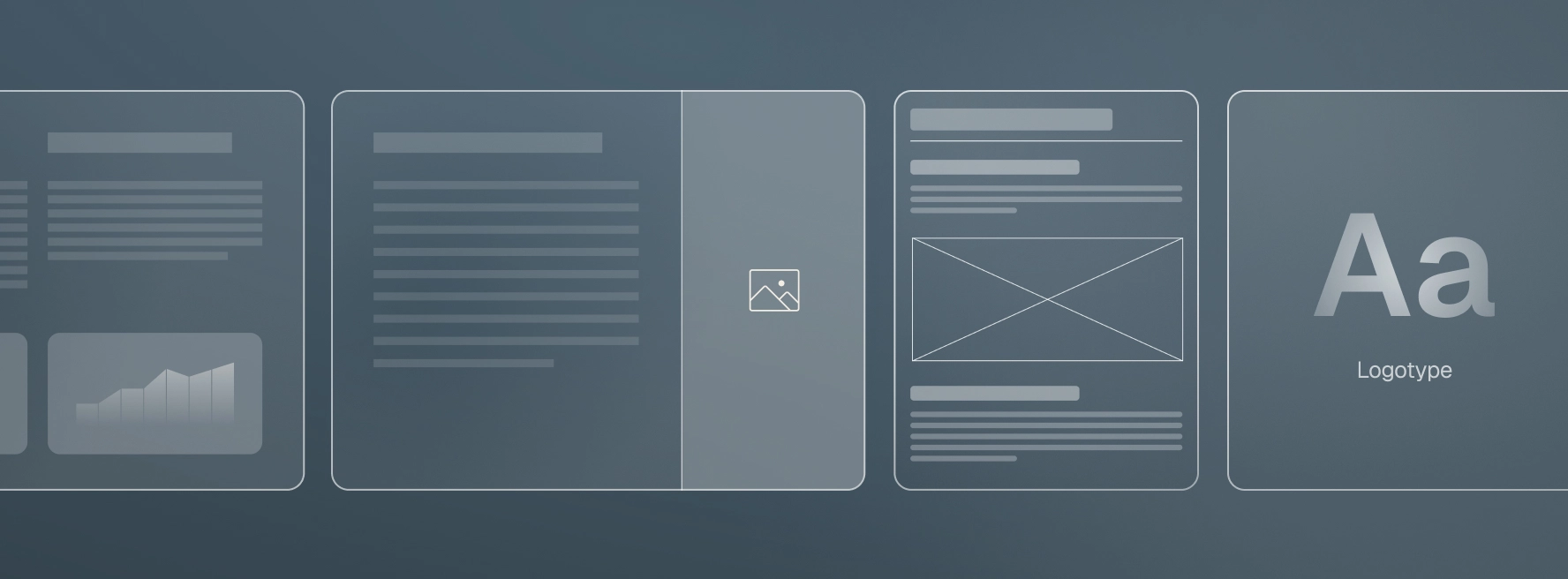
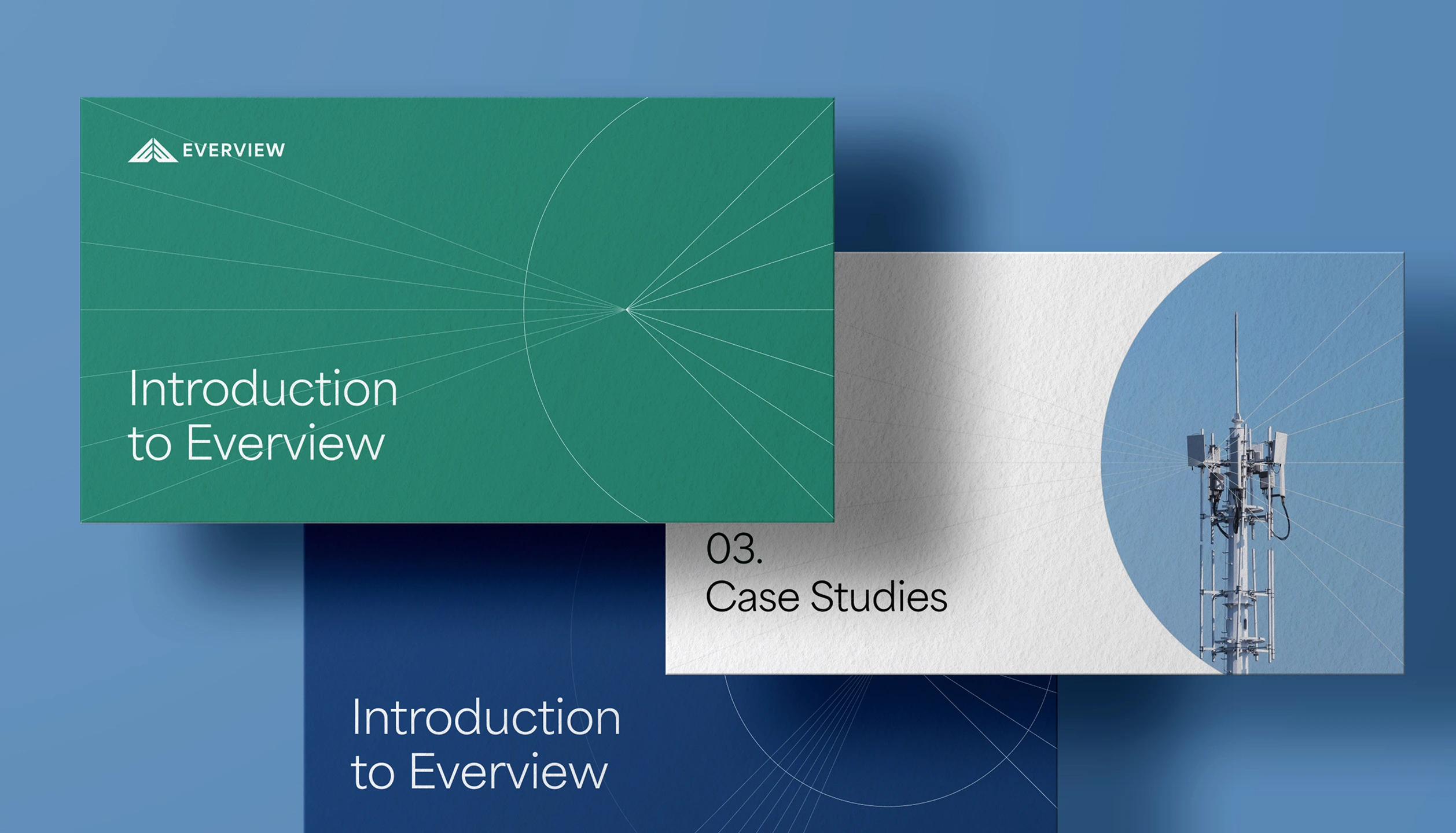
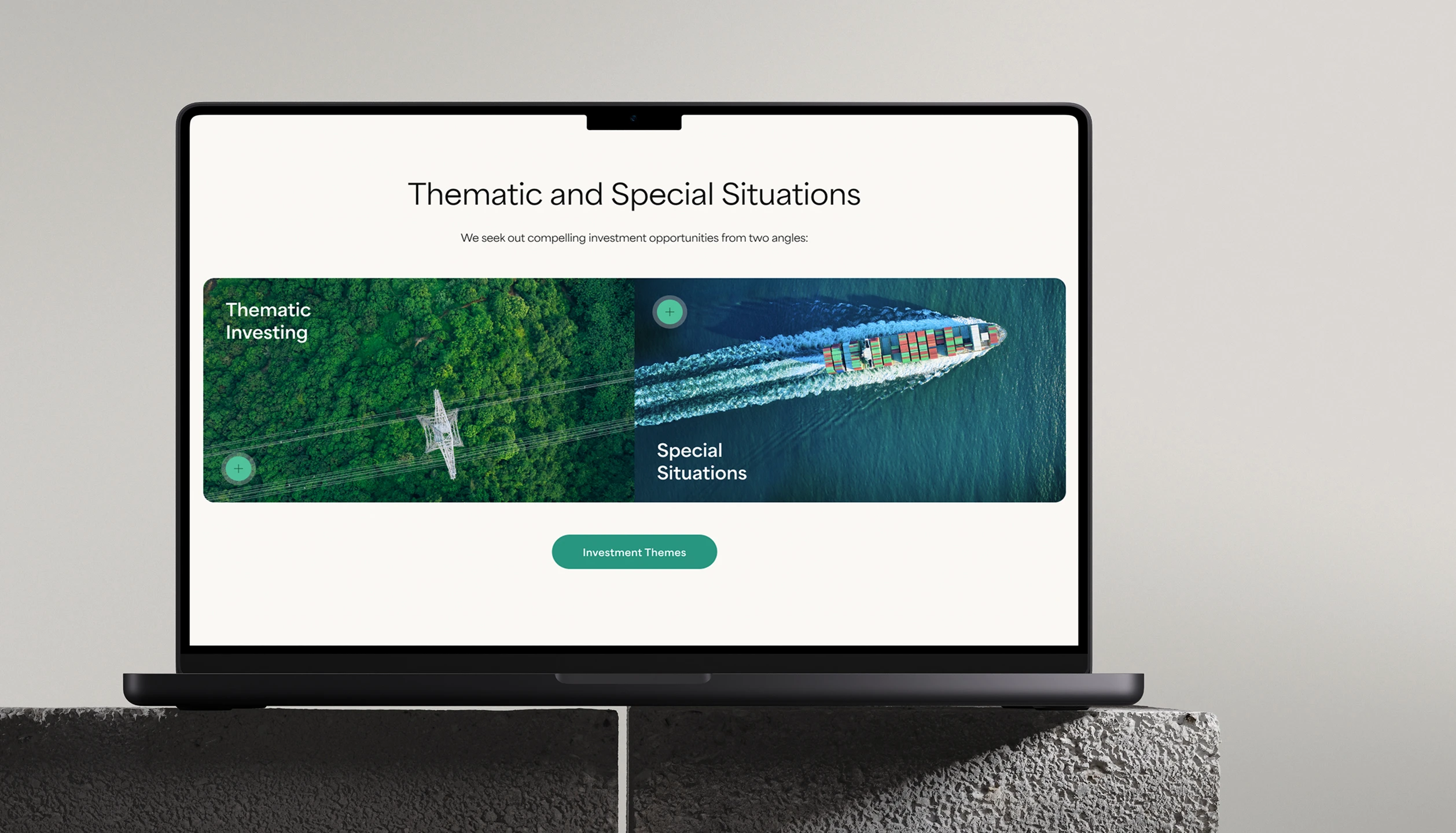
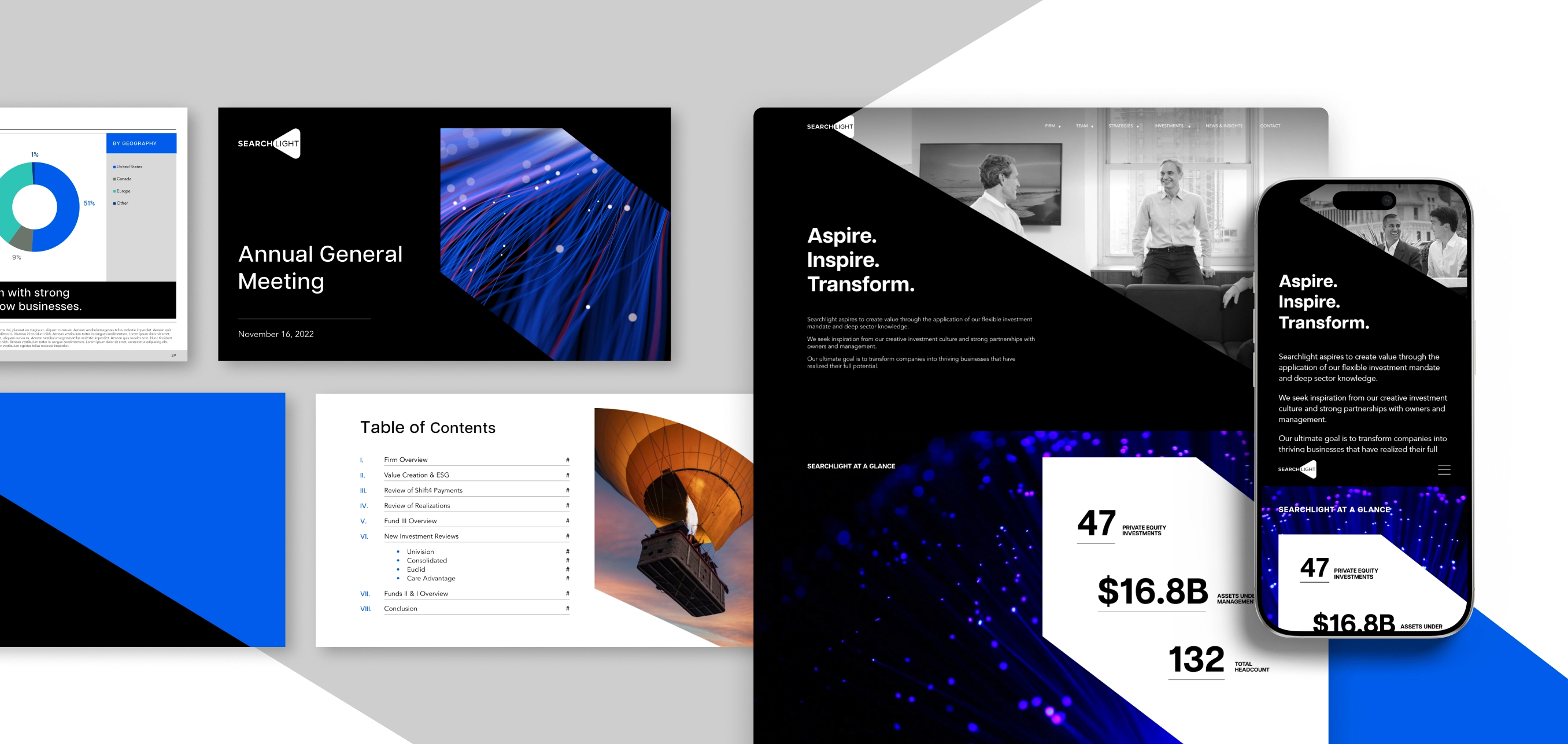
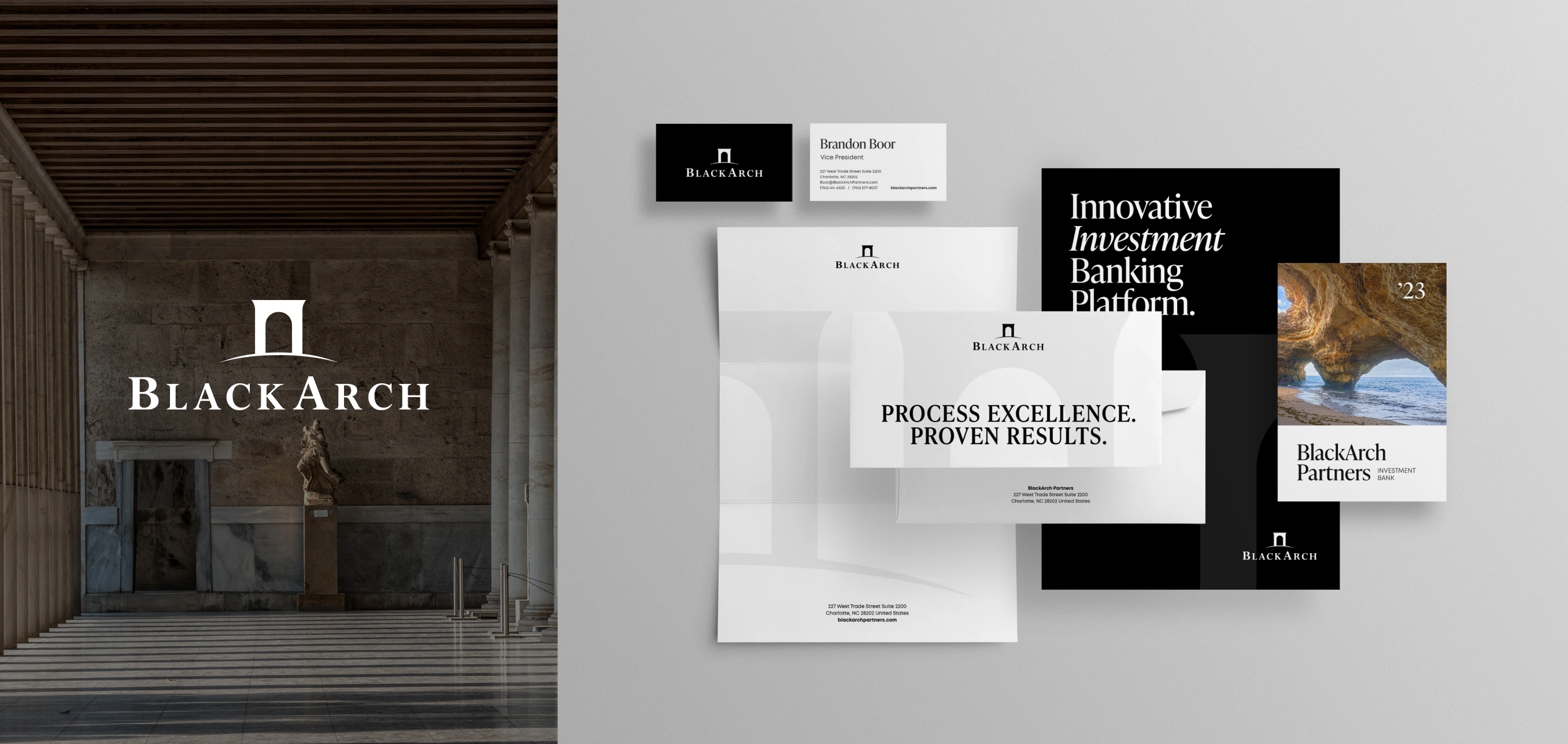
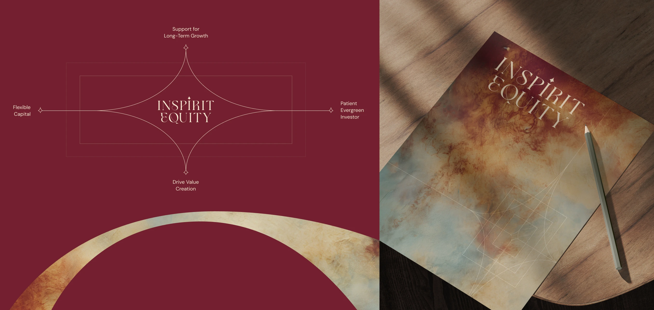
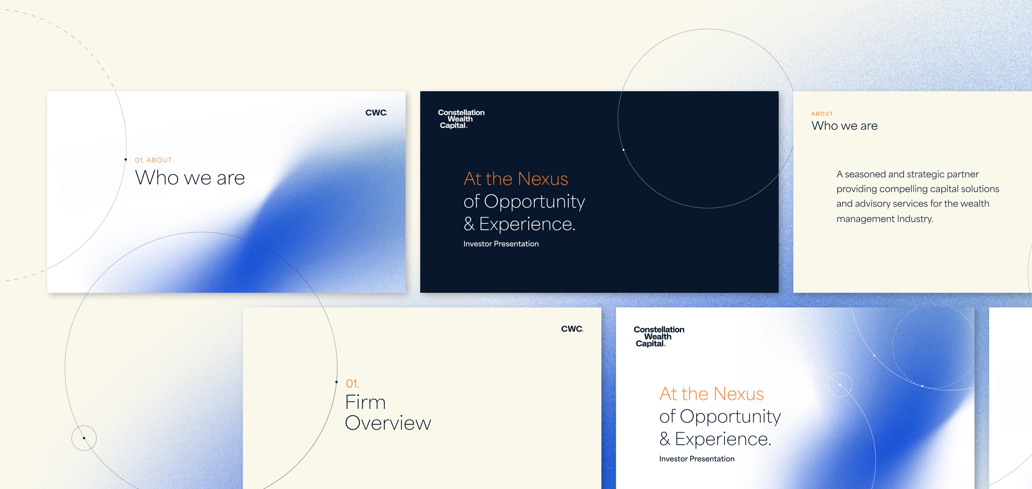
While most visual brand development projects are tied to external deliverables like websites or investor presentations, they can also be delivered as stand-alone engagements. In every case, the true test of a visual brand is how it performs in application — in websites, reports, decks, signage, and conferences. That’s where design choices stop being theoretical and start shaping real-world impressions.
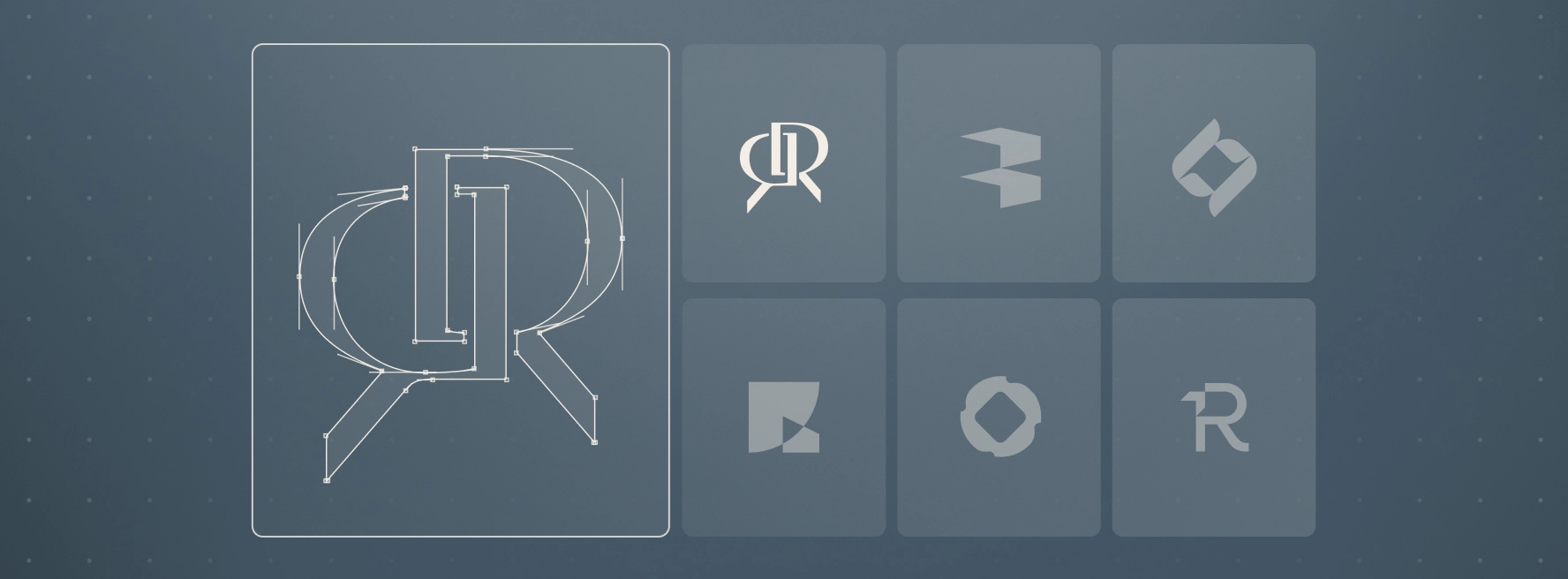
Examples of Expression
For some firms, visual brand development results in a clean, modern system designed to communicate institutional credibility. For others, it may involve a distinctive motif or metaphor that captures something unique about their approach to investing. Whether the expression is subtle or bold, the common thread is that it reflects something true and ownable about the firm — not a generic template.
Questions We’re Asked Most Often
Visual brand development typically includes a comprehensive design system: logo, color palette, typography, graphic elements, imagery style, layouts, and usage guidelines. It establishes the visual language that carries across your website, presentations, collateral, and digital channels.
A logo is only one component. Visual brand development defines the entire look and feel of the firm, encompassing how the brand behaves across materials, how it supports the message, and how it fosters consistency. A strong brand is never a symbol alone — it’s the ecosystem that surrounds it, reinforces it, and brings it to life across every touchpoint.
Messaging informs the design direction from the start. If the message focuses on expertise, operational depth, or other key attributes, the visuals reinforce these qualities through tone, structure, color, and hierarchy. Every design decision ties back to what the firm wants to communicate.
Most visual brand projects take 4-6 weeks, depending on the number of design directions explored and the level of refinement required. Timelines can be extended if paired with messaging or website development.