


Heartwood Partners
2019
Brand Development
Website Development
General Collateral
Founded in 1982, Capital Partners is a middle market private equity firm that is known for its hallmark conservative investment approach that finances companies with a higher equity, lower leverage strategy.
In the middle of 2019, Darien Group was engaged to facilitate a rename and full rebrand in order for the firm better communicate their current-day strategy, values, and differentiators.
After over three decades of establishing a strong reputation with management teams and business founders, our firm needed a refresh to more clearly reflect our unique investment approach. Darien Group partnered with us on the evolution of our name and identity to Heartwood Partners, a brand that effectively captures our differentiators and embraces our roots and core values.
Rob Tucker
Managing Partner

The initial discovery phase was critical to lay strong foundations for the subsequent work to follow. It captured the core of the firm’s narrative, including the sheer history and tenure of the firm and its leadership team, the unique partnership style the firm brought to its management teams, and its commitment to growing its portfolio investments for the long term.

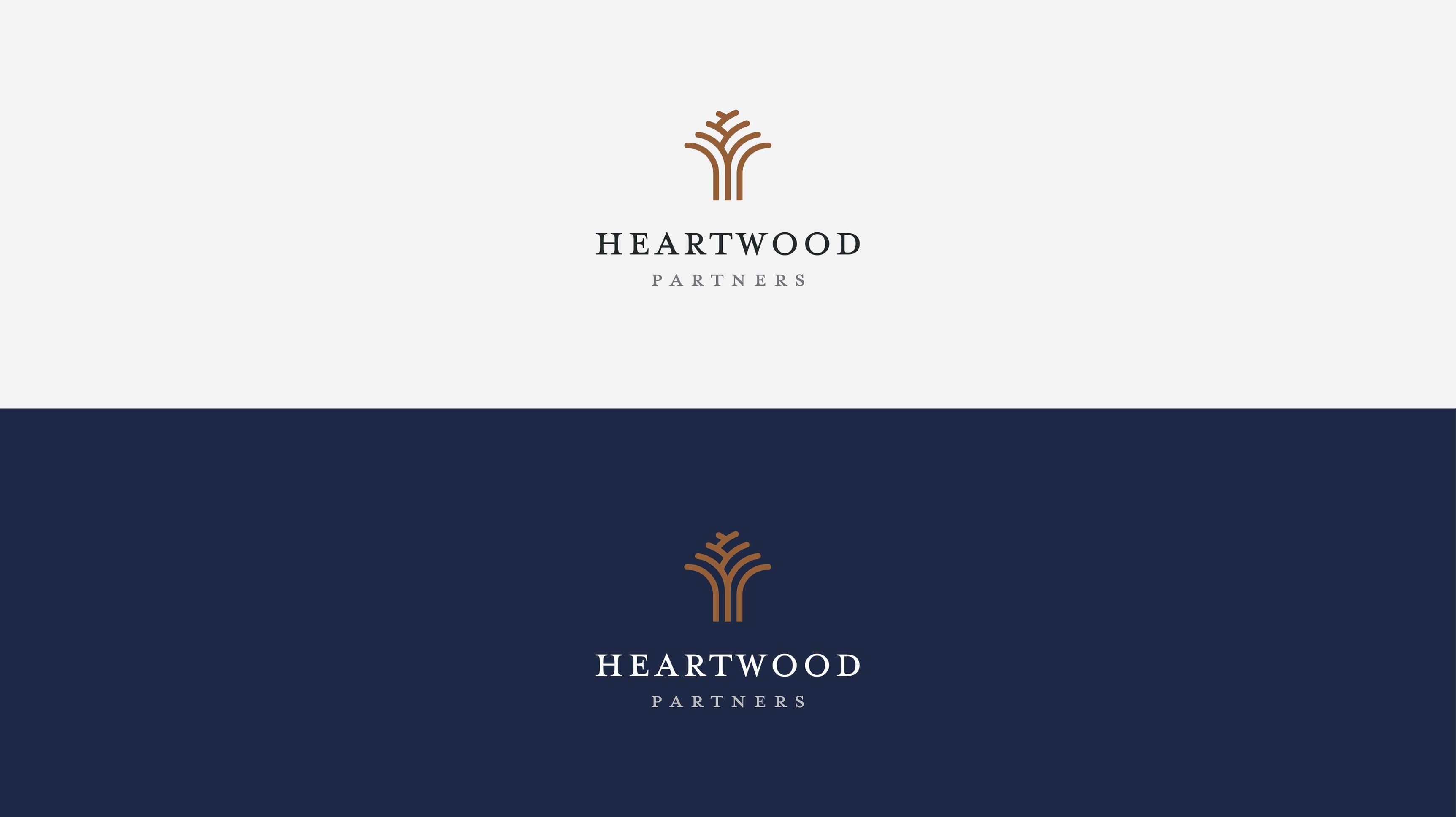
Out of these messaging pillars came the new name selection for the firm: Heartwood Partners. The word heartwood refers to the solid, innermost part of a tree trunk, which yields the strongest timber and provides support to the tree. Its definition represents the supportive and growth-oriented partnership style that characterizes Heartwood Partners.


Key to the development and design of the new Heartwood Partners website was ensuring that there was a continuation of fundamental narratives, such as the firm’s partnership style with management teams and its unique investment approach, while advancing the visual brand through contemporary design and elegant site functionality.
Through the use of a rich color palette, a blend of classic and modern fonts, and subtly animated elements, the end result is a digital platform that resonates with Heartwood Partners’ core audiences and creates a unique storytelling environment that communicates the firm’s value propositions in a compelling and attractive manner.


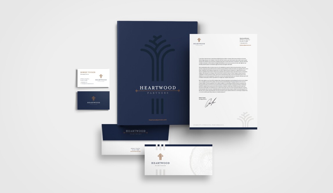
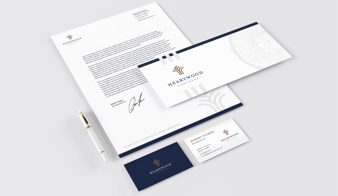
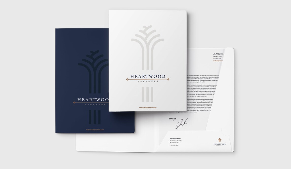
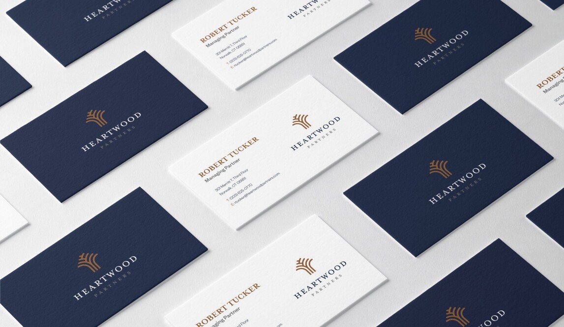
As part of the full brand rollout, the new visual brand was carried throughout the brand identity system, including business cards, letterheads, presentation templates, marketing collateral, and email blasts. The complete distribution of Heartwood Partners’ new colors, fonts, logotype, aesthetic, and messaging was crucial to ensuring that the announcement of the new brand was done with conviction and consistency.