
Intentional Choices for Lasting Impact
Through an intentional rebranding process, Darien Group unveiled a revitalized brand identity for Harvest Partners that embodies energy, reliability, and approachability — all hallmarks of the firm’s 40+ year commitment to progress.
The refreshed brand reflects the private equity firm's distinct position in the market, balancing heritage with forward-thinking ambition.


A major component of this digital transformation was the development of a modernized website that provides a cohesive narrative bridging Harvest’s origins, current market position, and future aspirations.
Rather than simply listing strategies and services, the site tells a story — highlighting Harvest’s unique perspective on middle-market private equity. The elegant, functional design features an uncluttered sans-serif font, bold headings, a clear hierarchy, and a sophisticated palette of neutral tones with green and blue accents, all within a clean, structured layout with ample white space and high-quality images.


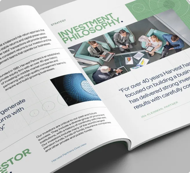

The new website exemplifies the Harvest brand through clear, client-centric storytelling that highlights its growth-focused approach and differentiated investment strategies. Dynamic visual design combines custom animations, structured layouts, and the iconic Harvest Green to create a modern, polished aesthetic.
A cohesive design unifies Harvest’s four investment strategies — Flagship, Credit, Structured Equity, and Ascend — under one consistent, recognizable brand. This new website strengthens Harvest’s position as a middle-market investment leader, offering a polished and unified experience for partners and new audiences alike.


